Jon Ericksen – The Pale Light C15
Jon Ericksen – The Pale Light C15
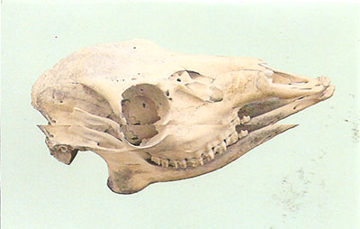
The artwork for this release is a minimalist/kitschy affair using a light blue j-card with an animal skull on the front. The design works on a few levels so it sets up for the music although the sound here isn’t perhaps what I was expecting.
Jon Ericksen creates some filthy distorted tunes. Yes tunes, because there is “music” happening behind the layers of distortion, minimalist kind of piano lines that remind me of early Philip Glass or something, but they’re difficult to make out among all the overblown distorted layers. The only things I can really compare this to is early Dan Deacon (but switch out the drums for melodies) or the work of Mincemeat or Tenspeed.
If the release is anything it is unique. You just don’t hear music or even noise that is like this. Does it work? Well I haven’t really made up my mind yet on that front. But it piqued my interest enough for multiple listens. For the adventurous among you.
| Composition: |      |
| Sounds: |      |
| Production Quality: |      |
| Concept: |      |
| Packaging: |      |
| Overall Rating: |      |


Leave your response!